
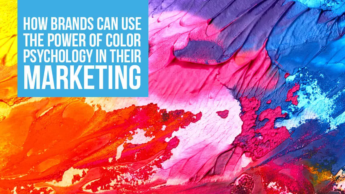
How people react to a certain color on your ad, website or landing page has a direct effect on your conversions. Will they click the button on your call-to-action? Will they read your pop-up graphic? Will they notice your email subscription box? Did you know that your conversion rate can increase without changing anything about your webpage except for the color of the call-to-action button? The power of color in marketing is immense and it’s crucial to use the right way.
The Perception of Color
Colors have a much greater role in influencing our buying decisions than we think. According to Neil Patel, 85% of consumers base buying decisions on color, and full-color ads in magazines get recognized 26% more often than plain old black and white ads. Color helps people recognize the brand, just think of Coca-Cola’s usage of the color red, McDonald’s yellow “M” sign, and Facebook’s blue logo with white letters.
In the ocean of content marketing, for ads, and websites, the right color combination can help your brand stand out. Color psychology works best on a homogeneous audience. If you do have a diverse audience, you might need to test different color schemes on different target groups. Try testing different colors on different age groups, locations, and professions. When it comes to getting people to click a button or sign up, it’s not a question of which color is magical – it’s a question of passive and active colors, of high and low contrasts – so again, you must test on a small number of your potential customers.
Color Can Inspire a Shopping Spree
The one thing that actually matters to your audience is whether or not the color suits them. Consumers try to fit colors that are evocative of certain emotions and actions. It’s what gets them to see what you want them to see, feel what you want them to feel, and to do what you want them to do. The trick is to know which category of emotions your company belongs to and then choose colors that accentuate the tone. The best way that you can do this is to not go along with stereotypical associations (i.e. yellow means happiness and red is for excitement) but instead take the colors in the context of your brand that signal the actions and feelings you want to evoke.
In advertising the thing to keep in mind is not what looks good to the person creating the ad – but what color fits what is being sold. By using the Logo Company’s guide to color emotions you can easily match what you are selling to the color that complements it. Studies have shown that the colors orange, red, royal blue and black appeal to impulse buyers. Whereas teal and navy should be used for bargain hunters.

Cultural Differences
When designing advertisements, you must also think about where they are going to be seen, as different cultures react differently to color. So an American might consider yellow cheery and bright whereas a person from Latin America will associate it with mourning and death.
Psychology of Color
The key to mastering color psychology in marketing is to use color to support your already existing brand personality, rather than create your brand persona based on the color association you select. The brands that use the psychological effects of color to their advantage choose the right colors to further communicate about who they are through their overall content, ads, and website. Know your brand story and choose the perfect color to tell it with.